
MedTech, Pediatric survey redesign
Role: Product/UI/UX Designer
Timeline: 6 months
Tools: Figma, FigJam, Google Sheets, prototyping, Product strategy, UX research, interface design
Type: Health & Mobile UX Design
PediQUEST is a long-running, NIH-supported survey tool that helps children with serious illness, and the parents who care for them, check in each week on pain, fatigue, mood, and wellbeing. These check-ins help clinicians understand how a child is doing over time, and guide care around what matters most to each family.
Ch 1: PediQuest Before Redesign ↩
Research shows that receiving feedback through the system can improve emotional wellbeing and physical quality of life. Because completing the survey is linked to better outcomes, usability isn't just a design concern, it's part of the care itself.
The current experience tells a different story. The weekly questionnaire as it exists today runs on dense serif text with limited user feedback, no visible progress, no save status, no clarity on how the data is used.

That gap is what set the roadmap:

Ch 2: Who We Are Designing For .ᐣ.ᐟ
Meet Jayna, Anna's mom and the coordinator of her care. She's 38, balances part-time remote work with tracking symptoms, medications, and appointments, mostly from her phone.

Meet Anna, who is 9 and lives with a malignant brain tumor. Treatments, fatigue, and hospital visits have narrowed her school, social, and play time.


Empathy maps gave us a structured way to articulate what we currently believed about our users.
Ch 3: How We Are Researching 𓂃✍︎
How did we start? We evaluated the app through a heuristic evaluation, a Flesch readability score, and a MARS analysis. Together they surfaced broken user control, weak accessibility, high reading levels, and an overall app quality of 3.065 out of 5.
Heuristic evaluation: We scored the app against Nielsen's 10 usability heuristics. Across four evaluators, we found 27 issues on average, clustering around broken user control, failed WCAG accessibility, weak error prevention, and vague system status that adds to survey fatigue.

How many questions, and of what kind? We looked at five PediQUEST surveys, roughly 430 questions total, spanning a Baseline intake, the CPS pain survey, the monthly PMS, a Weekly check-in, and the PQ5–6 survey for ages 5–6.
Those patterns collapsed further: 14 recurring question patterns consolidate into 12 reusable components, frequency scale, severity scale, Yes/No binary, degree scale, rating scale, free text, numeric stepper, duration picker, visual analogue scale, multi-select checklist, single-select, and date picker.
A MARS score of 3.065 out of 5, weakest on engagement and aesthetics; and a Flesch readability average of 65 against a grade-6 target of 70–80, with half the sampled questions scoring "not accessible."

Three themes rose to the top: make PediQUEST feel reciprocal, protect the core reporting flow by keeping it simple and dependable, and design for consistency and motivation with familiar patterns and light motivational cues.
Competitive analysis studied five analogous products, two direct and three indirect, to compare design patterns, engagement, and interaction models that could improve PediQUEST.

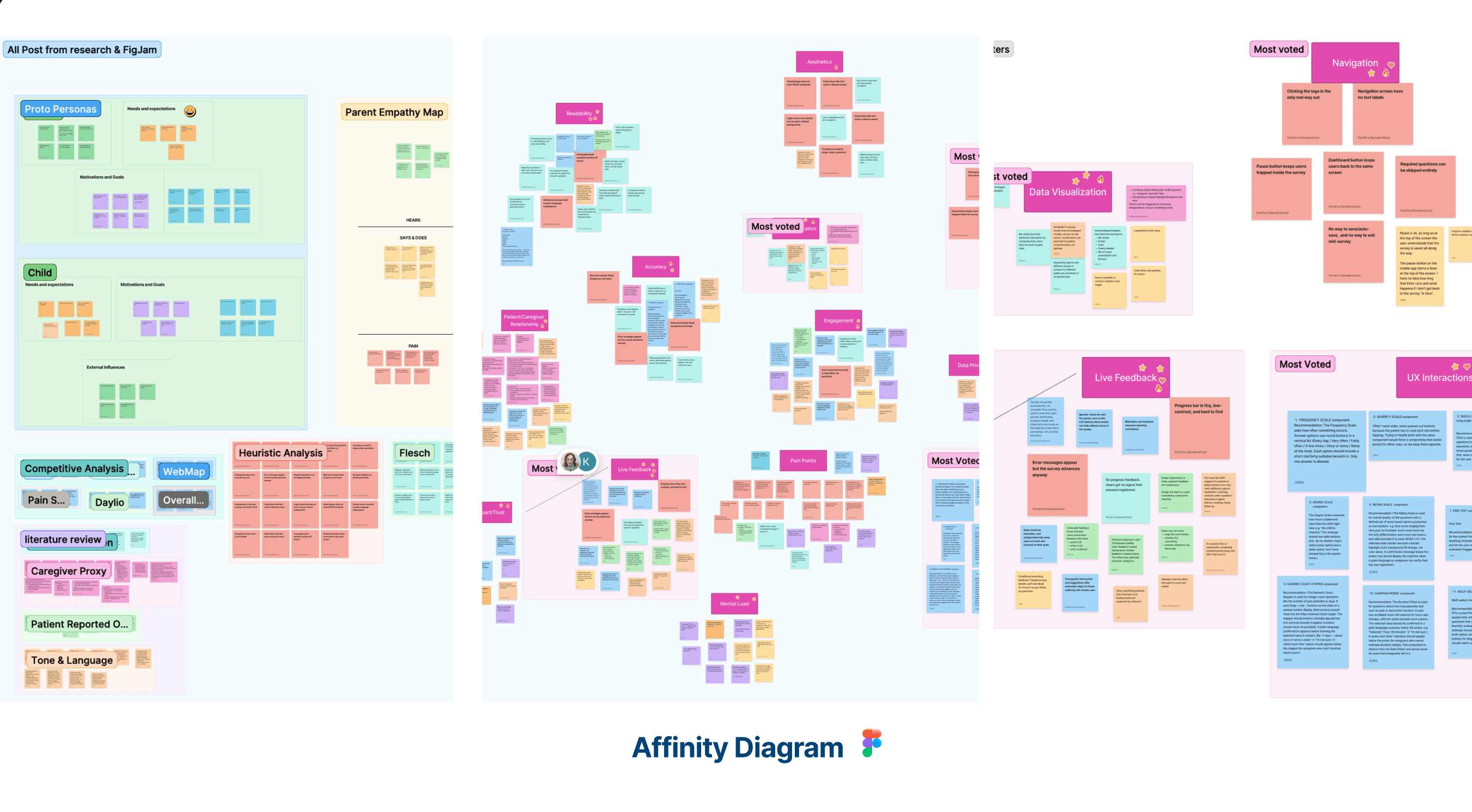
Caregiver interviews came next. We interviewed parents of children with severe neurological illnesses, having them share their screens and think aloud as they walked through the app — so we could see where things make sense, where they slow down, and where the process asks more than they can give.
Following the interviews, the team individually hand-coded each transcript and reached consensus on 12 coding themes. The top codes by occurrence: Verbiage (51), Visual Design (42), Emotional Wellbeing (39), Caregiver Burden (38), and Data Reports Display (37), a clear signal that language, visuals, and reporting were where the experience was breaking down hardest.

That synthesis distilled into four core findings: navigation traps users and destroys trust; silence reads as indifference, since the app takes data and gives nothing back; input types across several components create usability and data-accuracy problems; and caregivers want to feel like partners in care, but the one report PediQUEST gives back is hard to read.
Ch 4: Where We Are Going ⁀➴
The research turned directly into four design principles: reciprocal, not extractive, every interaction should give something back; clinically rigorous, not clinically cold, data integrity paired with warm, accessible language; low literacy by default, an equity requirement; and designed for exhausted users, every friction point removed is meaningful.
From there came the annotated sketches, and four key concepts:

Ch 5: What We Built & Who Tested It 𐦂𖨆𐀪𖠋
With a spring of research tucked under one wing, we as Team Catalyst thought, what should PediQUEST actually look like?

Choosing a visual direction started with two outfits going to a vote with our parents and partners. Option A paired Plus Jakarta Sans with Helvetica Neue; Option B paired EB Garamond with Roboto Serif. Parents liked A's bolder blue and bigger text; one wanted real contrast and no curly fonts. Partners picked A, and the caregiver test picked A again, but the real finding wasn't a font at all: everyone agreed on one thing, make the text and colors easier to read.
The design system followed: a full palette running from Blue Zodiac and Sapphire down to warmer accents like Supernova, Meteor, and Amaranth, each with an exact hex value locked in. Below that sit the core components.

What we tested was the mid-fidelity prototype the parents put through its paces in rounds two and three, every question type got its turn: dropdowns, scales, and answers in progress.

What each parent showed us, up close: P1 hit 81% task success (22 of 27), found reports and privacy info without help, but couldn't find the save button and said the quality-of-life score felt "depressing." P3 hit 85% (23 of 27), was blocked by the date picker, and stayed positive about the redesign overall. P4 hit the highest success rate at 88% (22 of 25), never saved but felt safe stepping away regardless, and had the easiest time reading text of any version so far.

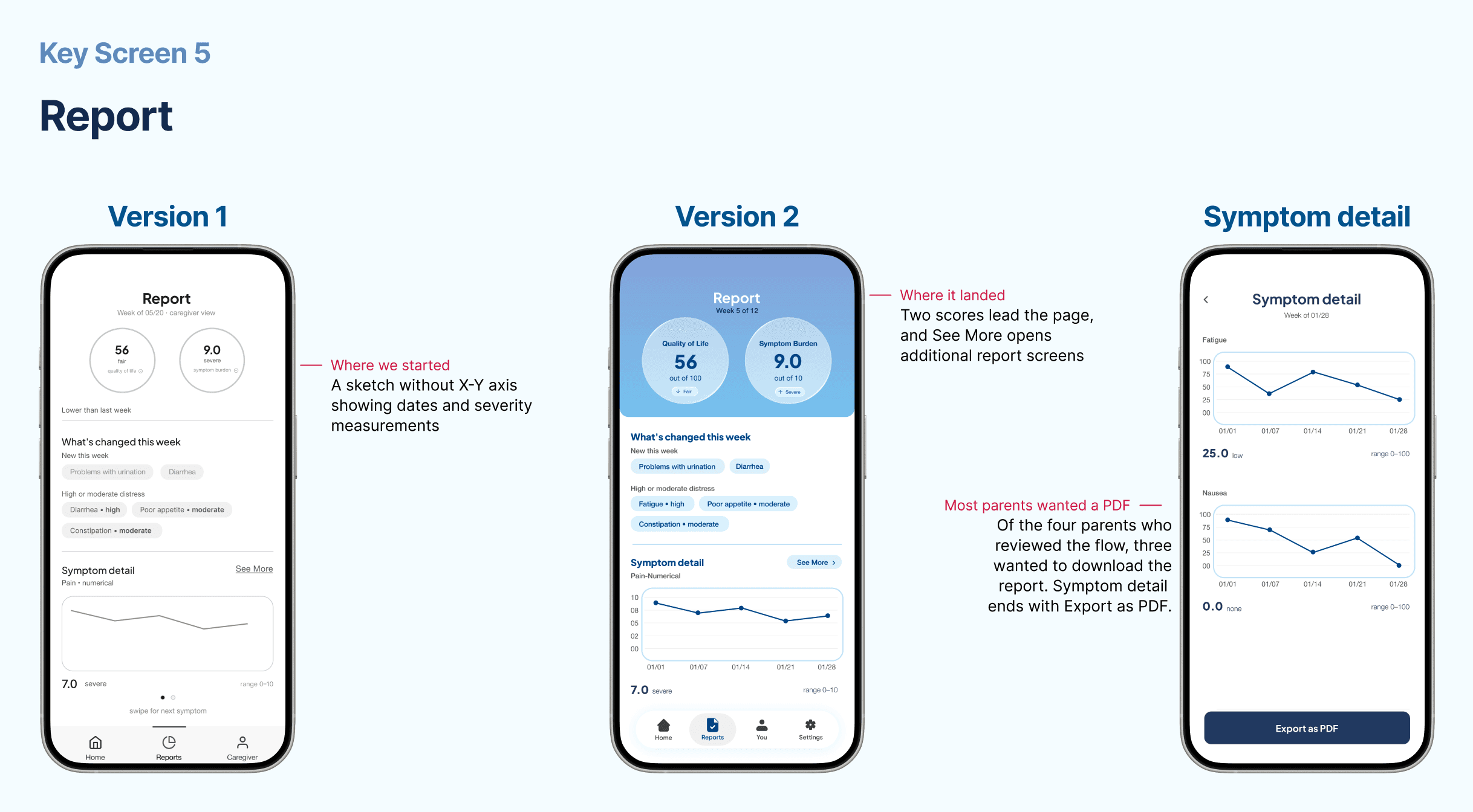
From mid-fi to hi-fi, the design changed with the feedback. "Save & resume needs to be explicit" became a named Resume modal showing exact progress. "Score interpretation aids" meant Quality of Life and Symptom Burden now carry their scale on the face, with labeled, plain-word trend lines. "Let me add my own goals" gave the You tab a "+" for personal goals, neutral tag colors, and a privacy statement.


What I Learnt for a Healthcare App
Don't change the survey wording. Questions are NIH research-validated and arrive as content, developers may only touch buttons, errors, and empty states.
Health information doesn't ride in a text message. Reports go out as a PDF download or email.
A hard week is never treated as unusual. Pause and skip are framed as permission, not failure.
Guard the data like eggs in the nest. Passwords and health answers are protected data: never logged, never exposed.
Accessible. WCAG AA: real contrast, screen-reader labels, dynamic type
Passing the torch comes next. In September a new flock arrives: the UCI dev team. The owl leaves them a map, the annotated hi-fi screens, the design system, and named states for every interactive element, all in one build reference. The one big idea underneath it all: templates, not questions.