
EdTech, AI-driven teacher dashboard plus student game
Role: Product Designer Intern
Timeline: 6 months
Tools: Figma, Google Sheets, Asana, prototyping, Product strategy, UX research, interface design
Type: Mobile, Tablet, Web UX Design


RightOn! and MicroCoach are two halves of one idea. I co-built MicroCoach end to end, from sketch to the AI-supported dashboard: a teacher tool that parses quiz results through a knowledge graph (CZI's Learning Commons API) into a specific next step.
RightOn Play is its sibling, a live classroom quiz I helped design and test. This case study covers MicroCoach first, screen by screen, then RightOn Play's features and fixes.
MicroCoach
Building the loop, from sketch to system ࣪ ˖⏱ ˚.
I designed four surfaces end to end: landing, upload, login, and dashboard.
Each one was shaped by testing.

Landing. I sketched this one myself: a welcome screen with a simple promise, "your students have the answer, MicroCoach helps find them." That sketch grew into the product's core loop, Assess, Understand, Plan, Reflect, so a teacher always knows where they are.


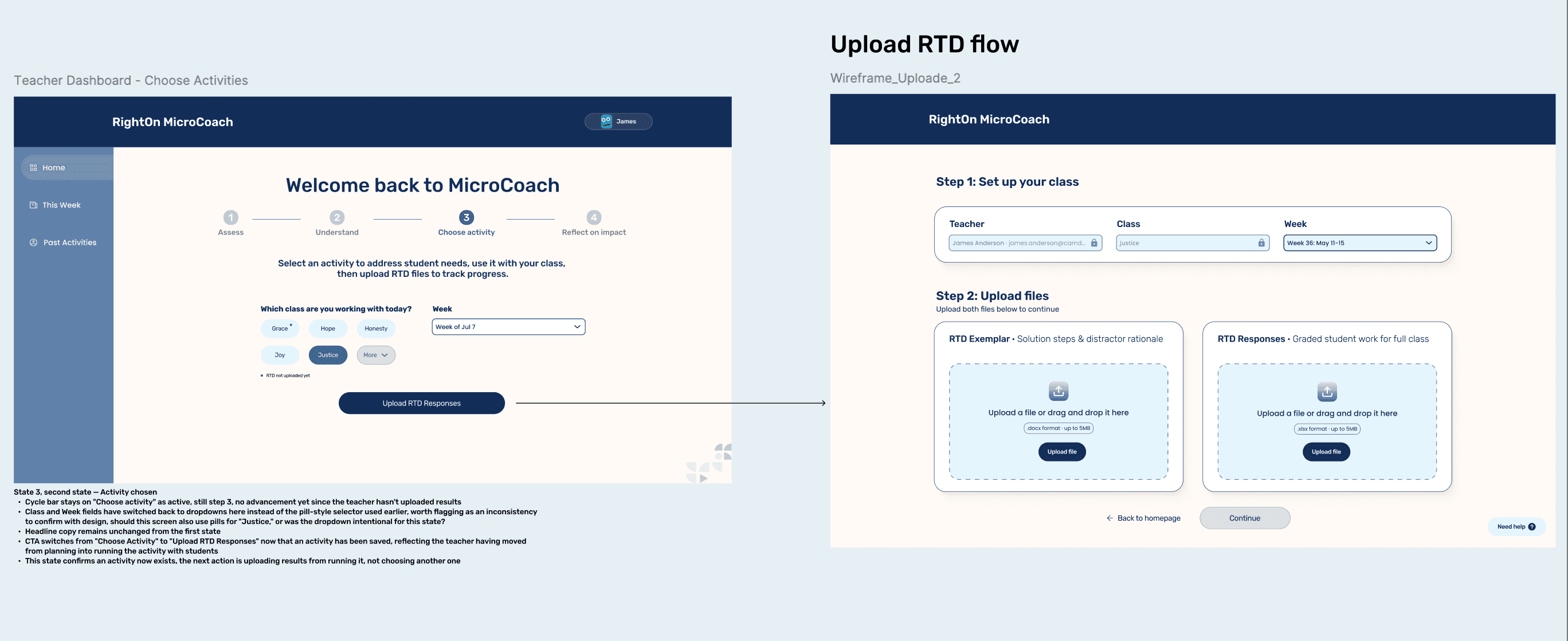
Upload. Capped at 3 focus points per screen after testing with about 3 math educators and 6 more students and teachers showed more caused overload. Assessment framework options (Balanced Feedback, Actionable Feedback, Effort & Growth, Project Evaluation) came out of that same review.


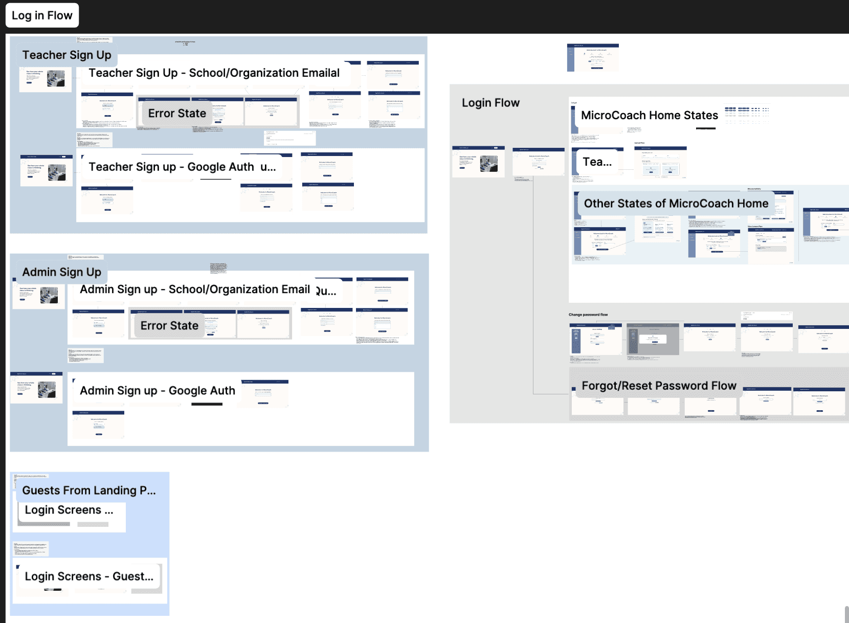
Login. Teacher dropdowns show name and institutional email together. Class-selection dropdowns under 6 options became direct rows instead, cutting clicks. QA also ran across 3 environments, Windows Chrome/Edge, Mac Chrome, Chromebook, to catch layout breaks before ship. Game hosting stays locked to verified teacher accounts, student data stays fully anonymized.


Dashboard. This is where testing pushed back the hardest. Co-facilitating sessions with math educators and specialists surfaced two findings that reshaped it: Ay-Nur Najm flagged that remediation depends on reading the median student, not outliers, so the dashboard now leads with class-wide trends. Dr. Paul Chin flagged cognitive fatigue, too much AI output reads as judgment, so recommendations cap at three trends, a strengths metric sits next to the errors, and student-level detail hides behind a "view details" click.


Interaction design was benchmarked against 4 adjacent dashboards, ASSISTments, Eedi, Magma Math, and Glimmer, to keep the interaction standards competitive. Separately, we tracked feature parity against Magma Math, SmartGradr, and GradeWithAI to sharpen the value proposition: every one of them is good at collecting and grading, none of them tell a teacher what to do next. That gap is MicroCoach's dashboard, built around one core signal: who got it right by accident, and who got it wrong with total confidence.
[IMAGE PLACEHOLDER: three competitor screenshots, Gradenix, SmartGrade, GradeWithAI, next to the trend mapping panel and error rationale card.]
MicroCoach had to act like a thought partner, not an autograder, so the interface forces teachers to review actual student work before it suggests a next step.
📌 Building the loop, from sketch to system
MicroCoach started as pencil sketches on paper: a welcome screen, an upload flow, a rough idea of what a teacher would see first. From there it grew into one repeatable loop: Assess the data, Understand the issues, Plan a lesson, Reflect on impact, then start again. No new tool to learn each time, just the same four steps done well.
Teachers didn’t just want to know who got it right. They wanted to know who got it right by accident, and who got it wrong with total confidence.
• Testing ran across 3 environments: Windows Chrome/Edge, Mac Chrome, and Chromebook.
• Class dropdowns under 6 options became direct selection rows, saving teachers clicks.
• Teacher dropdowns started showing name and institutional email together.
• Game-hosting stayed locked to verified teacher accounts, while student data moved through the system fully anonymized.
• A persistent notification banner replaced pop-up alerts so teachers know when background analysis finishes.
• MicroCoach’s structured review ran with about 3 math educators plus 6 more students and teachers.
• Every screen was capped at 3 focus points max.
• Design decisions were benchmarked against ASSISTments, Eedi, Magma Math, and Glimmer.
📌 Where everyone else stops
Wireframe placeholder — competitor screenshots side by side: Magma Math, SmartGradr, GradeWithAI.
We tracked MicroCoach against Magma Math, SmartGradr, and GradeWithAI. Every one of them was good at collecting and grading. None of them told a teacher what to do with the results. That gap, from grade to next step, became MicroCoach’s whole reason to exist.
📌 Taking Play into real classrooms
Research summary placeholder — stat grid plus teacher persona card.
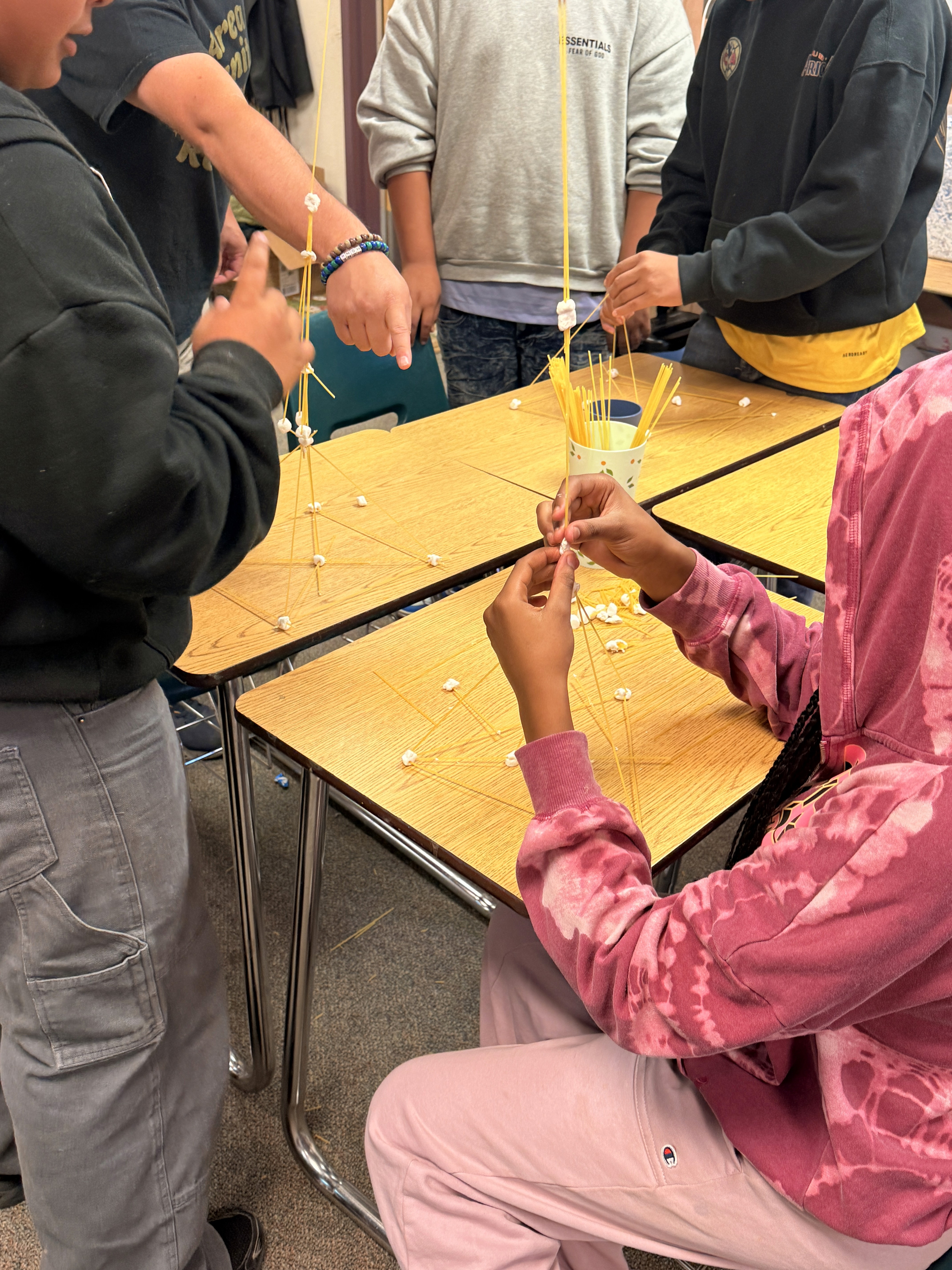
RightOn Play couldn’t be tested the way MicroCoach was. It needed a real room, a real teacher, and real kids. Through a partnership with BACR Expanded Learning Programs, I co-facilitated live testing sessions in Antioch-area classrooms alongside site teachers, with 5 to 8 students at a time.

• Teachers couldn’t tell which student picked which answer — a real visibility gap.
• Teachers wanted to see exactly what students were seeing in real time.
• Multiplication to exponents was a consistent stumble during warmups.
• The onboarding screen left students unsure if they’d actually joined.
• Getting disconnected meant getting stuck with no way back in.
• Chromebooks worked. Phones, even on good wifi, often didn’t.
• Some students picked an answer and assumed that was the submission. It wasn’t.
Session 1
Jumped straight into the game. No intro, so kids asked questions all session. Moved past answer explanations too fast to discuss. Didn’t moderate display names.
Session 2
Waited for all 8 kids to load into the lobby first. Ran a 30-second intro up front. Zoomed out to see every student card. Removed inappropriate names before starting.
One change, waiting in the lobby before starting, visibly fixed the session. That became the recommendation: default every host into “wait in lobby” mode.
📌 Teaching the teachers first
Before RightOn! ever reached a classroom, it had to convince the adults in the room. Two PD sessions ran with instructors from Mission Graduates, a Mission District organization supporting 1,500+ kids a year.
5 of 8 teachers
Raised their hands when asked if kids find math challenging.
Only 2 of 8
Strongly believed encouragement alone helps kids perform better.
That’s the whole design problem in two numbers. Everyone agrees math anxiety is real. Almost nobody believes a pep talk fixes it. RightOn! had to be more than encouragement. It had to show progress.
A brainstorm on “mistakes are where ___ ___” produced answers like learning happens, changing happens, shining happens, language that made it straight into the product’s tone.
Asked how to explain a 10% increase, even trained instructors defaulted to “add 10, then subtract it” instead of multiplying. When the actual method was explained, the reaction was universal: “too much math,” “oh man, my brain.” That single moment justified MicroCoach’s entire misconception engine.
📌 The error message nobody meant to ship
Wireframe placeholder — join-game error screen with callout arrows.
Somewhere in the original build, a small failure was quietly breaking trust. If a student’s session dropped and they tried to rejoin, they hit a wall: “Unable to join this game. A player with that name has already joined the game.” No explanation. No next step. For a middle schooler already nervous about math, that’s enough to make them give up entirely.
Working with our engineer Drew during QA, we rebuilt that message into: “Saved. You can update until time ends.” Same underlying system state. Completely different message to a kid: you’re not locked out, you’re fine.
📌 Wave 2, by the numbers
10–15
classrooms targeted
~11
teachers recruited
8 weeks
design to handoff
4 days
cross-team QA
2 weeks
paused during state testing
📌 Giving it a face
Design token placeholder — RightOn Emerald Green swatch, type specimen, matte cream base.
The visual system stayed quiet on purpose. RightOn Emerald Green (#1FA97D) as the one accent color. FreightSans Pro body text in a soft gray, #4A4A4A, over a matte cream base. Teachers live in this product for long, data-heavy sessions. The last thing it needed was more visual noise.
📌 The final screens
Bento placeholder — secure gateway, classroom dashboard, trend mapping, error rationale, pedagogy guide, efficacy summary.
Captions: Sign in. Run the class. Spot the trend. See the work. Plan the lesson. Prove it worked.
📌 The real lesson
MicroCoach taught me what it means to own a product start to finish: every sketch, every dashboard decision, every fix traced back to me. RightOn Play taught me what it means to design alongside a live classroom, where the feedback is immediate and the stakes are a real kid’s confidence. Together, the hard part was never collecting data. It was making the gap visible: between what a student got right and how sure they felt, between a grade and what a teacher should do next.
